Cathy Hunt, of iPad Art Room, is here to provide some effective design principles for making ebooks with Book Creator.
Many people know how to write a great story. But when it comes to publishing your own ebook, how do you transform your book from a good read into a work of art where text, images, audio and video jump off the page?
In a media-rich world, visual literacy is increasingly important.
By thinking about a few key principles of design as you construct your work, you can develop the tools you need to create beautiful books.
A teacher’s perspective…
As educators, we’ve all seen those books that feature rainbow backgrounds, neon fonts and images angled across the page! Students often make design choices because they like the look of various elements and can sometimes put little thought into their combination.
These explorations are great entry points for learning, but let’s uncover a few concepts that can help us to gain more control over the content we create.
Use these tips for your own learning, or if you’re a teacher, use them to guide your students and help them in their ability to create and communicate effectively, and develop skills that can be enhanced as they publish their own stories, ideas and information.
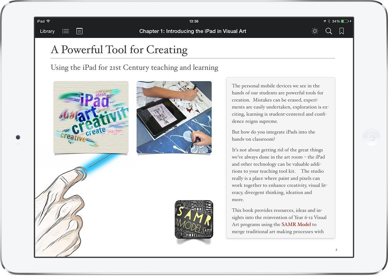
Above: Cathy Hunt’s iPad Art book (made with iBooks Author) has a consistent visual theme throughout.
1. Choose a theme
There are many places you can start as you begin to think about a theme for your book. The theme is very important to communicate the ‘broad message or idea’ in your book. The combination of words, images and everything else need to be presented with a style that is appropriate to the subject.
2. Visual unity
When I am talking to students about their pages, I ask them to look at the ‘whole’ rather than the ‘parts’ and consider what they might be saying to me. This visual unity is a central element of graphic design. When all the elements in a project work together, with a balance between variety and unity, you’ve got a successful design.
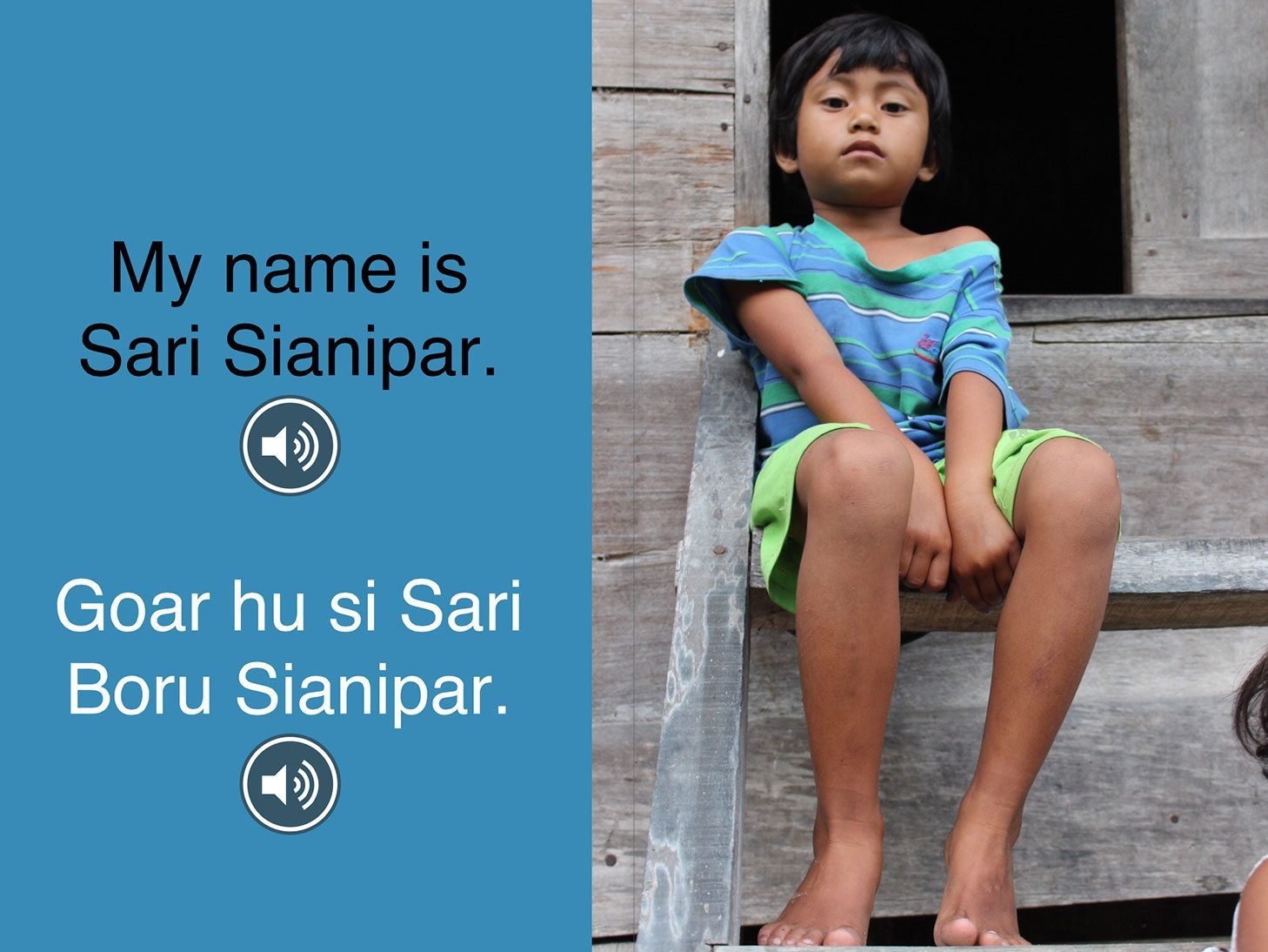
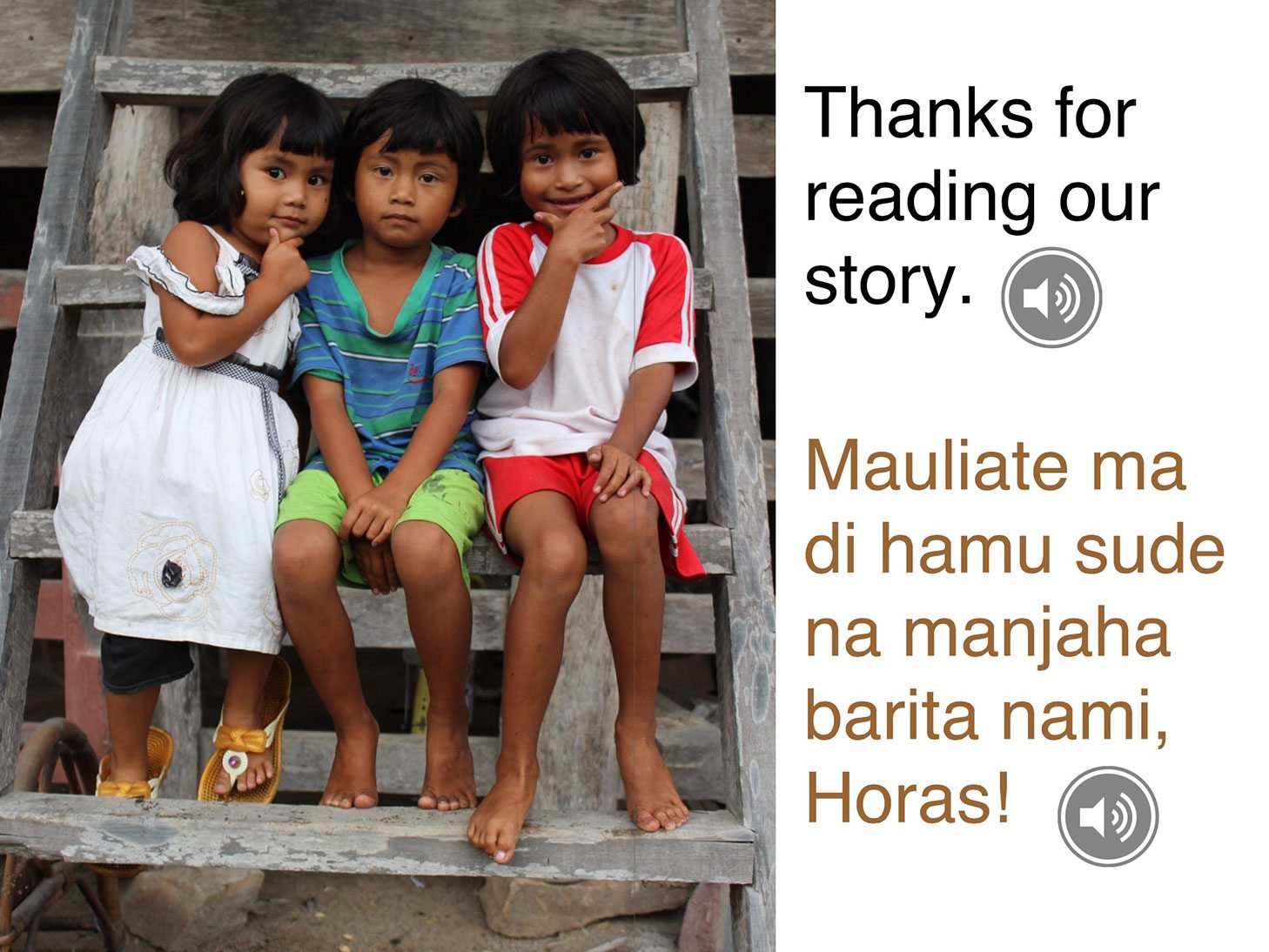
Below are some examples of how titles, text and images can be combined on a page for visual unity.


3. Colours
Which colours best represent your central idea or theme? Think about what colours represent and how they make you feel as you think about your theme.
Choose a palette to work with that reflects the mood or message you want to present and use it consistently throughout your book. You may want to consider using black, white or neutral tones if you want images to take centre stage, or the content is very ‘busy’.
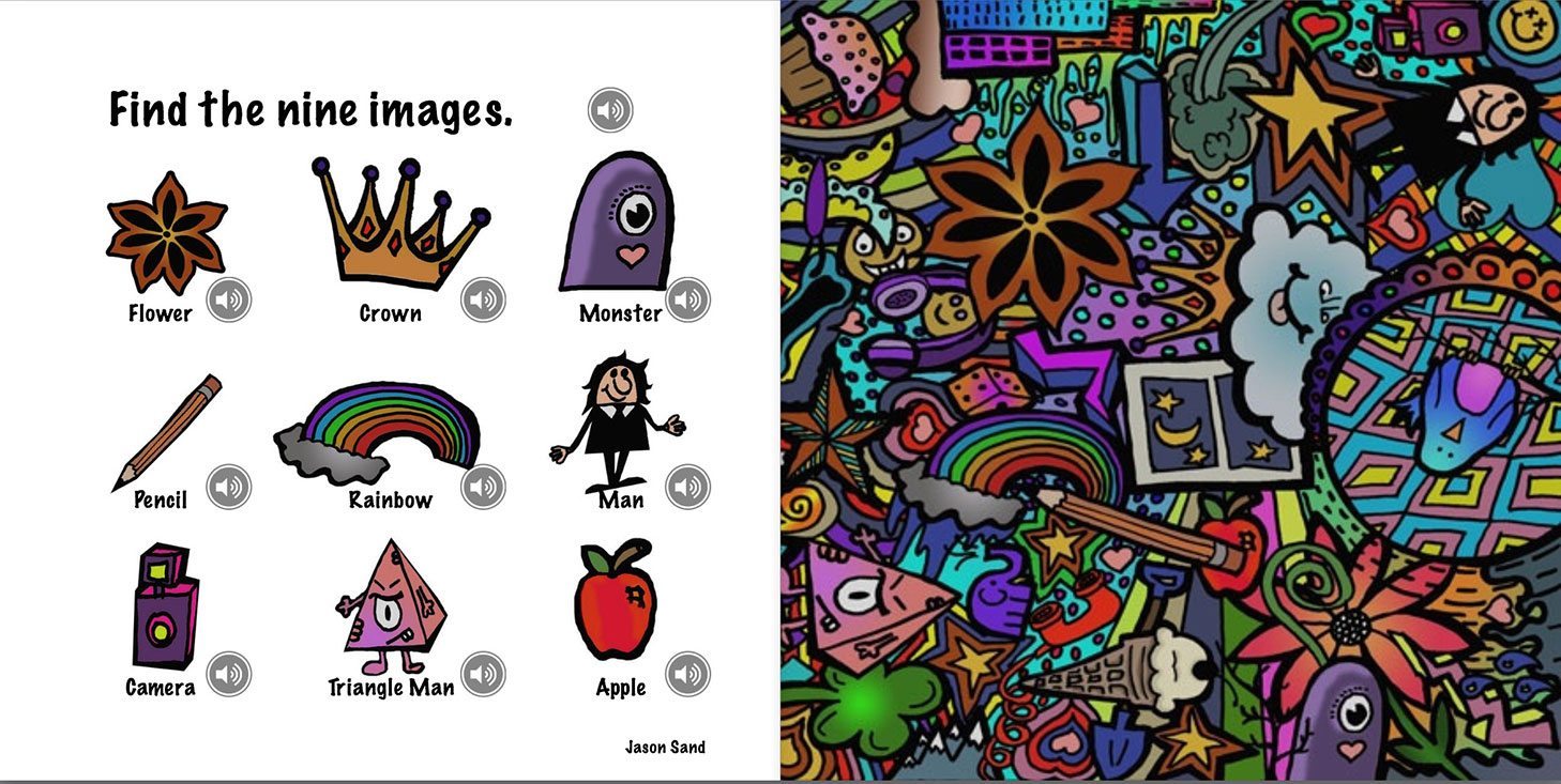
In contrast to the dynamic graphics on the right side of this spread above, a simple layout using a white background and a grid structure to present the images provides clarity. (Example: ‘Found It‘ – by Jason Sand).
Colour theme creator – Adobe Color CC
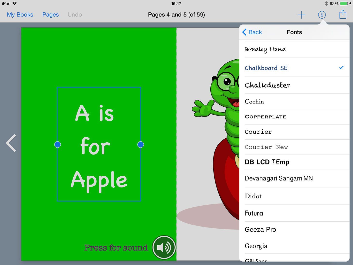
4. Typeface
Choosing the typeface for your book is a big decision. The main text font needs to be suited to the type of genre you are working with.
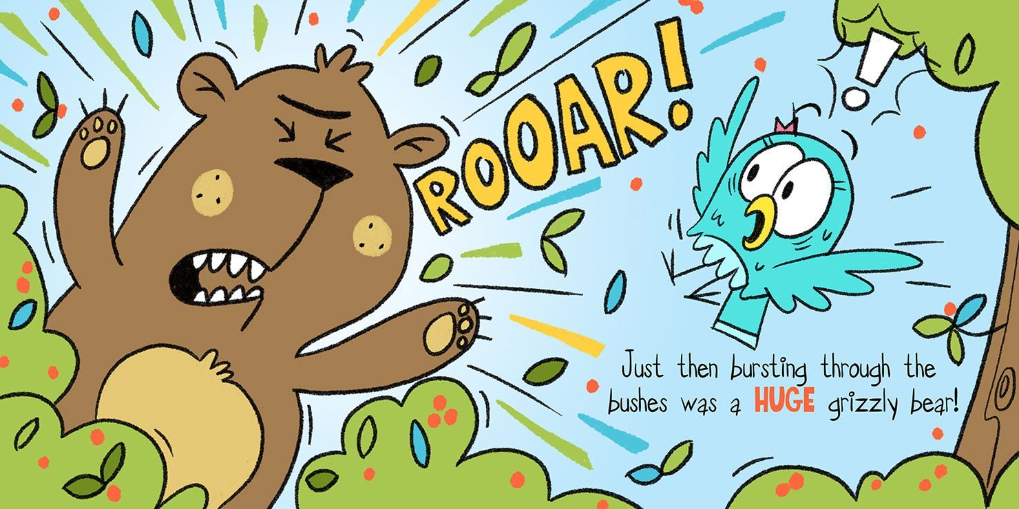
For example, you might want to use a fun, playful font such as Comic Sans or Chalkboard SE for child-friendly picture books like the ones below, but the same font would not be appropriate for a serious discussion about scientific research.
Making sure that your font is readable is very important. Some decorative styles can be pretty, but difficult to read.
For the same reason, it is rarely appropriate to mix lots of sizes, colours and styles. Stick to a set size for the text body, and when it comes to chapter titles and subheadings, think about using a contrast.
Using the same text types throughout the book can help the reader to navigate through your ideas.


5. Placement
Every item on a page should be placed with purpose. The way they are arranged will affect the way the book ‘talks’ to the audience. For example, positioning lots of images at various angles, overlapping each other is very casual when compared to this kind of grid layout.
Hot tip: A picture can say a thousand words – don’t be afraid to let your images do the talking by using a large size or presenting a visual element rather than lots of text.
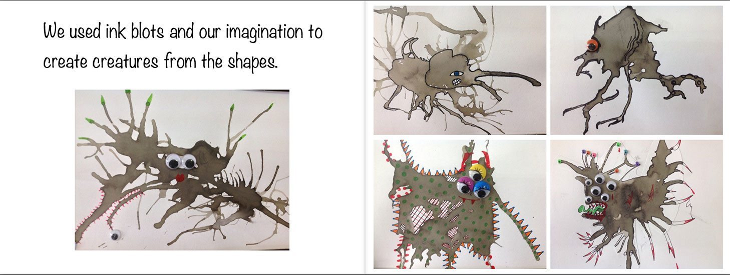
Ink Blot Monsters Book created by Year 6 students at Trinity Lutheran College
6. Contrast
Think about contrast. The distance between objects, separating unrelated items and grouping information for clarity. Think about using size, colour, shape and proximity to make key ideas and objects in the book stand out.
7. Alignment
 By considering alignment you can organise your pages so that they are clear in their communication.
When things line up they just ‘feel right’ for the reader, so think about planning your work using a grid so that you can balance your layout and align text and images. It’s easy to get excited about all the options. but keep it simple!
Hot tip #1: Left-aligned text is the easiest to read.
Hot tip #2: Make use of Book Creator’s alignment guides to make sure text, images and video align nicely on the page.


One of the best things you can do as you work through starting ideas for your own book is to take a critical look through your own bookshelf.
Ask yourself this really important question as you look at the title pages – What do you think the book is about… and how do you know?
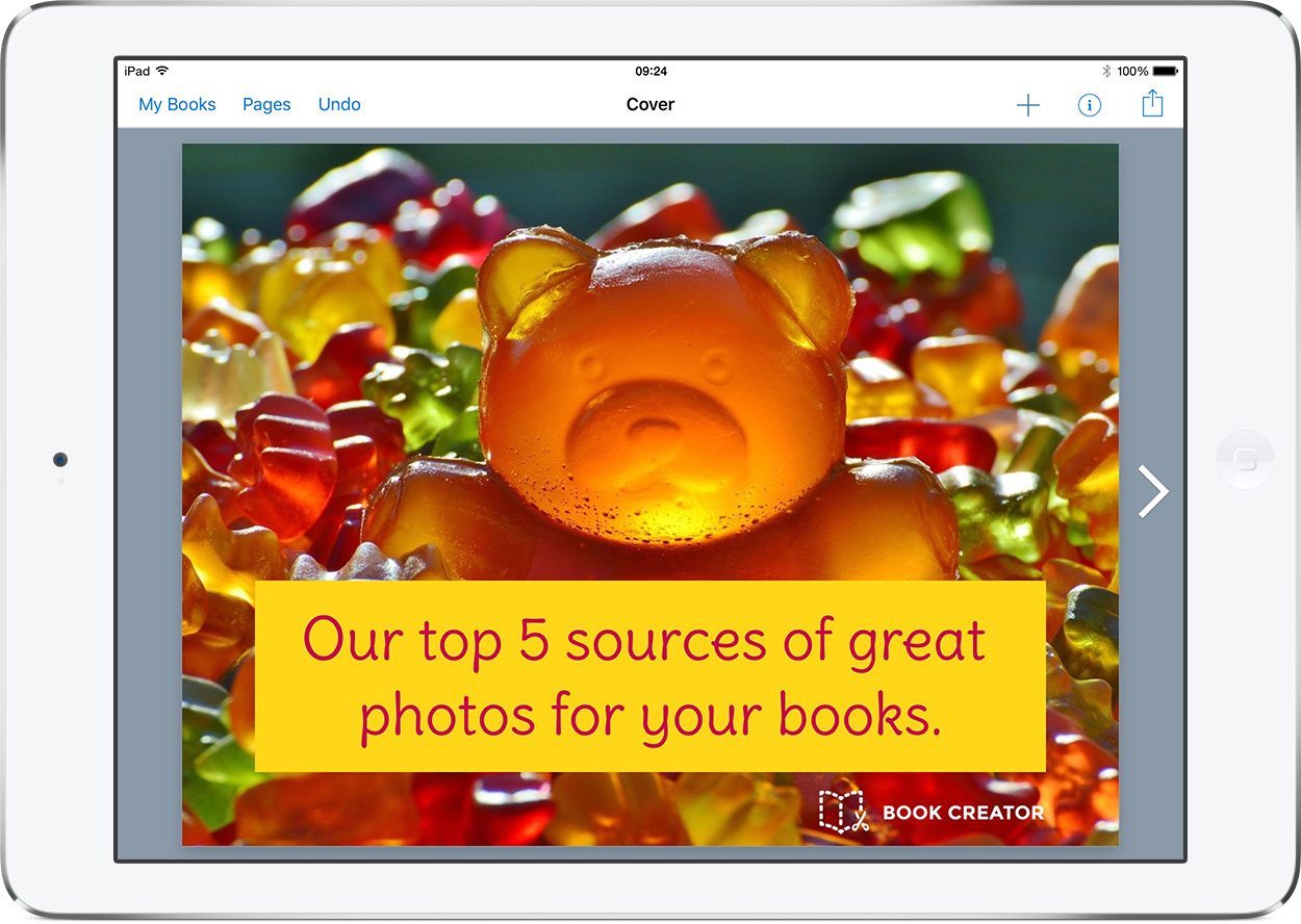
8. Think about your front cover
This is the ‘hook for the book’! By using the right words and images in combination, a book cover can ‘speak’ to potential readers. When a book cover is displayed online, readability is an important factor to consider.
Less is more – focus is on the book title and the author’s name for clarity. This means that the space and typography are really important. Choose your fonts and colours carefully with your theme in mind.
If you add an image, make sure that it adds impact and increases interest.


Check out a range of covers and see which ones you think work on our Pinterest board.
Hot tip: Remember you can add a cover to your book on the first page in Book Creator, but if publishing on iBooks you’ll need to upload a separate front cover.
9. Just do it!
The most important part of creating any book is doing it! Don’t get bogged down trying to make it perfect. If you keep these ideas in mind as you combine text, images and other interactive elements you’ll be on your way.
And remember, you can even create beautiful digital books you can share using your handwriting and illustrations on paper. So many ideas, right?!
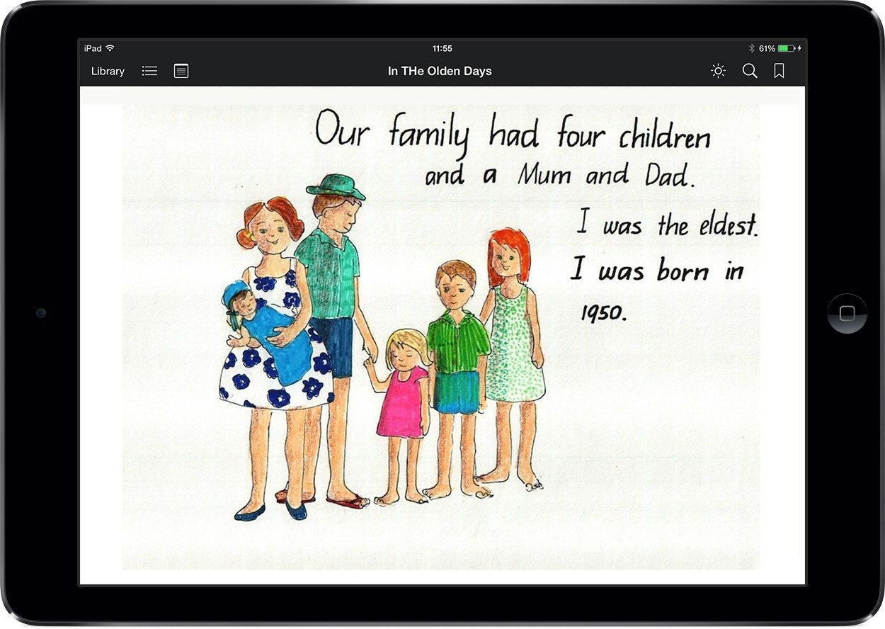
The beautiful book above was created by young children. They used scanned drawings and the Book Creator app to share the stories of their Grandparent’s life in Australia.
It’s a great reminder that although there are some important design ideas here in this post, the most important step in your publishing journey is getting started.
In the Olden Days by Shirley Connors.
A passionate advocate for the arts in education, Cathy Hunt is always keen to share her knowledge and experiences from her own classroom and beyond.
She is the teacher behind iPadartroom.com, a site full of resources for educators looking to leverage mobile devices for creativity. In her spare time(!) she is working towards her PhD.
She’s also an Apple Distinguished Educator and Book Creator Ambassador.
Related posts
-
 14 December, 2015
 -
 24 June, 2019
 -
 6 June, 2019
 -
 13 August, 2018
 -
 17 December, 2015
 -
 9 May, 2016
 -
 28 April, 2014
 -
 2 April, 2015
6 Comments on “9 Design tips to give your book a professional finish”
If I create and publish a book using book creator will the fonts and styles be copywright free?
Many thanks
Dean
Yes Dean.
What do you do if your text fills and over flows the page. Is there a way to format the text instead of having to use different text boxes?
Hi Mimi – in fixed layout ePub files (which is what Book Creator is for) text does not flow, so if you’re having formatting issues then you’ll need multiple text boxes.
I’m not a teacher. Can I use this software for 103 books I have written and illustrated.
Hi Dennis – if it’s for your personal use you’d need to use our iPad app, you cannot use our online version.